

Content Architecture
Grouping Components into Tabs, Accordions, and Sections
A flexible content-modeling pattern: use a lightweight Tab marker component to group page components into tabs, accordions, and other segmented sections — without deep nesting.
Sometimes a customer wants to render a content section where the components are grouped — most commonly as tabs, but the same need shows up as accordions, "show more" panels, and other collapsible or segmented layouts. The instinct is often to build one giant component that contains everything, or to bury content inside deeply nested linked content. Both approaches fight the editor.
There's a simpler, more flexible pattern: a lightweight marker component.
The pattern: a Tab marker component
Create a Tab component whose only job is to tell the frontend "start a new tab group here, and here's the label for it." The component model has a single Tab Label field — optionally an Icon and a Tooltip if the design calls for it.
Once the Tab component is added to the page, the editor adds whatever components they need to build out that tab's content — Rich Text, Images, Cards, anything. When they need another tab, they simply add another Tab component, and everything after it becomes the next tab.
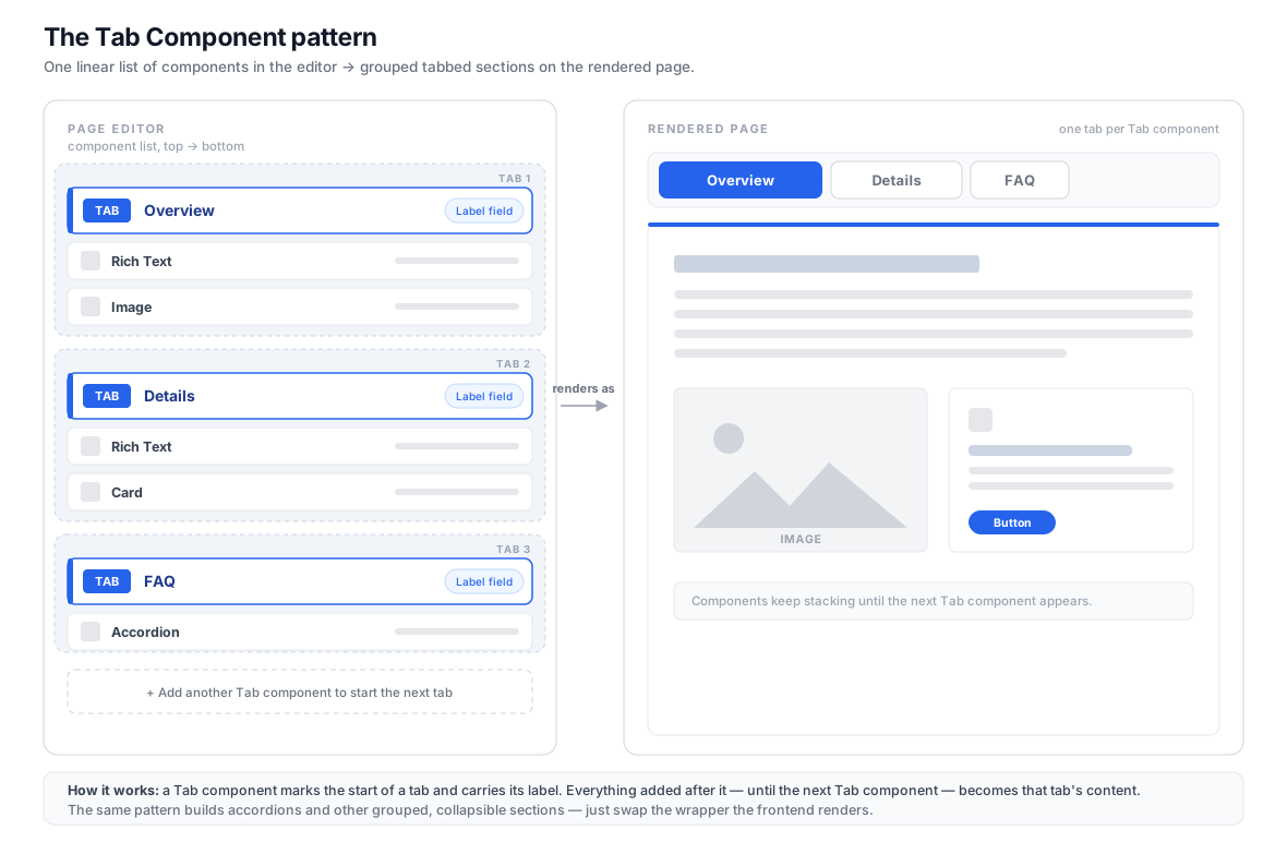
The editor keeps working with one flat, natural, top-to-bottom list of components. The grouping only happens at render time.
Modeling the Tab component
Keep the model minimal. The Tab component is a marker, not a container — it holds the metadata for the group, not the content itself.
| Field | Type | Required | Purpose |
|---|---|---|---|
| Tab Label | Text | Yes | The text shown on the tab button. |
| Icon | Text / Dropdown | No | An optional icon name if the design shows icons on tabs. |
| Tooltip | Text | No | Optional hover/help text for the tab. |
That's it. No content fields, no linked content. The content is whatever the editor places after this marker on the page.
How the editor builds the page
- Add a Tab component and set its label (e.g. "Overview").
- Add the components that make up that tab — Rich Text, an Image, Cards, etc.
- When the next section is needed, add another Tab component (e.g. "Details").
- Add that tab's components.
- Repeat for as many tabs as needed.
Because each tab is just a marker followed by ordinary components, editors can reorder, add, or remove anything using the normal page-editing tools.
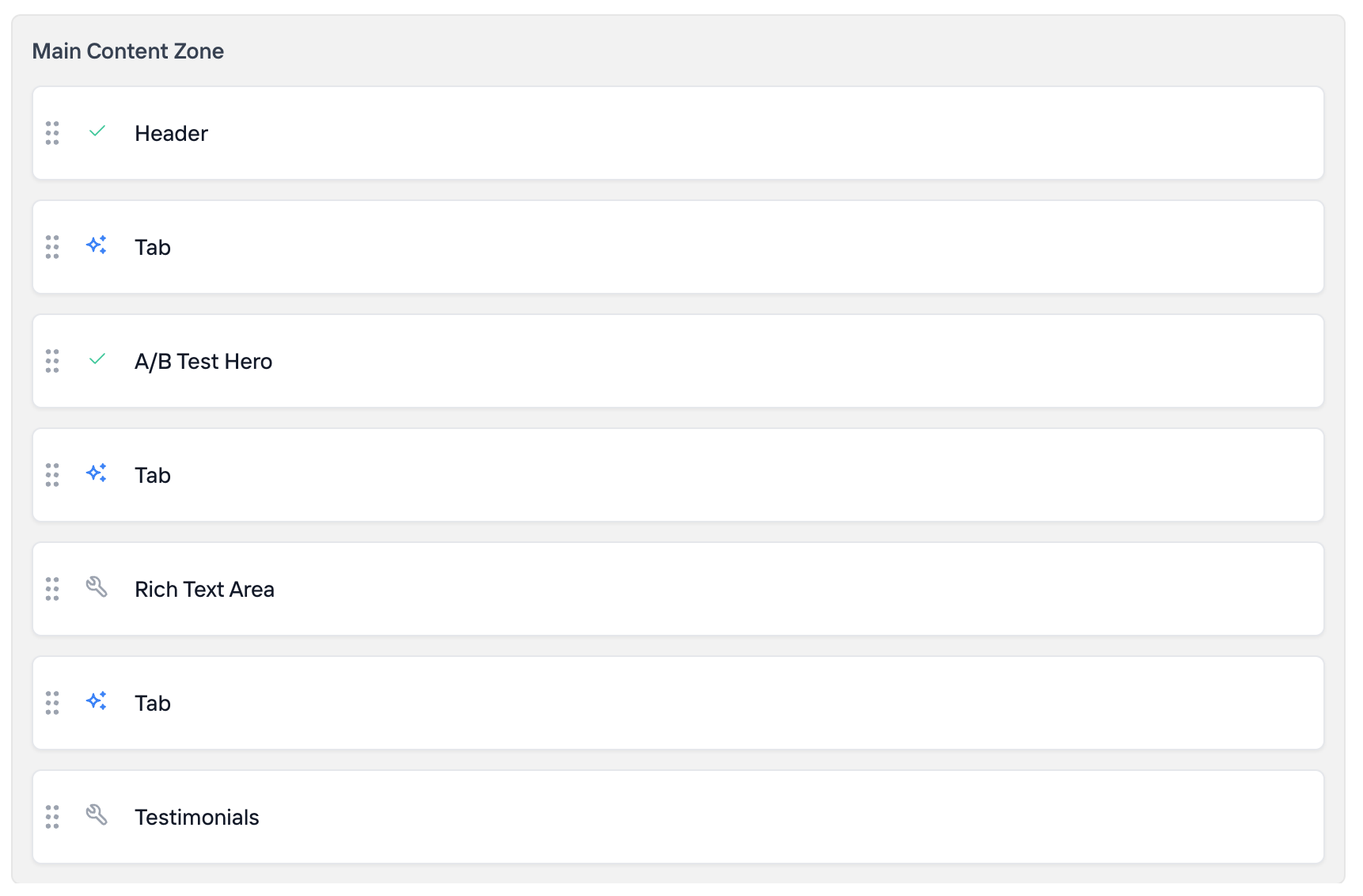
In the page editor it looks just like any other flat list of components — the Tab markers simply sit inline wherever a new group should begin:
How the frontend renders it
The grouping is a render-time concern. Instead of rendering the zone's modules one after another, the frontend walks the ordered list of modules and starts a new group every time it hits a Tab component, accumulating the modules that follow until the next Tab (or the end of the list).
// Group a flat list of page modules into tabs.
// Each "Tab" module starts a new group and carries its label.
function groupIntoTabs(modules) {
  const tabs = [];
  let current = null;

  for (const mod of modules) {
    if (mod.moduleName === "Tab") {
      // Start a new tab group, seeded with the marker's fields.
      current = {
        label: mod.item.fields.tabLabel,
        icon: mod.item.fields.icon,
        tooltip: mod.item.fields.tooltip,
        modules: [],
      };
      tabs.push(current);
    } else if (current) {
      // Belongs to the most recent tab.
      current.modules.push(mod);
    } else {
      // (Optional) modules before the first Tab marker —
      // render them above the tab strip, or ignore them.
    }
  }

  return tabs;
}
Render the resulting groups as a tab strip plus panels, rendering each group's modules with your normal component resolver. The exact wiring depends on your framework, but the shape is always the same: split the flat list on the marker, then render each slice.
A couple of edge cases worth deciding up front:
- Components before the first marker. Decide whether they render above the tabs or are disallowed by convention.
- A single tab. It should still render cleanly (a tab strip with one tab, or just the content).
Reusing the pattern for accordions and other groupings
The same strategy solves accordion-style collapsible sections and other component-grouping designs. Create an Accordion marker component with a Panel Title field, let editors add components after it, and start a new panel at each new Accordion marker. The frontend logic is identical — only the wrapper it renders changes (tab strip vs. collapsible panels).
This makes the pattern a reusable building block:
- Tabs —
Tabmarker → tab strip + panels. - Accordions —
Accordionmarker → collapsible panels. - Steps / wizards —
Stepmarker → sequential, numbered sections.
Why a marker component (instead of nesting everything)
- Editors keep a flat, natural authoring flow. No deep nesting, no modal-inside-modal editing.
- Any component can go in any group. You're not limited to the fields of a single "tab container" model.
- Reordering is trivial. Move components and markers with the normal page tools.
- The model stays tiny. The marker carries only the group's metadata.
The alternative — a nested linked content list inside one big "Tabs" component — locks every tab into a fixed sub-model and a clunkier editing experience. Reach for that only when you specifically need the group to be a single reusable, shareable content item. For page layout, the marker pattern is almost always the better fit.
Best practices
- Keep the marker component minimal — label plus optional icon/tooltip.
- Name markers clearly (
Tab,Accordion,Step) so the rendering layer can branch on the module name. - Document the "before the first marker" behavior for your editors.
- If you ever need group-level configuration (e.g. default-open tab, styling variant), add those fields to the marker that starts the group rather than introducing a separate wrapper.